Boosting Your Mobile First E-commerce Rankings
Let’s face it, we live on our phones these days. And if your e-commerce site isn’t working perfectly on mobile, you’re essentially missing out on more than half of potential shoppers.
Over the last five years, I’ve helped hundreds of small and medium businesses completely transform their mobile game.
I’ve seen firsthand how dialing in mobile optimization can send organic traffic through the roof (we’re talking 150% jumps!) and supercharge mobile conversions by as much as 200%.
Why Focusing on Mobile-First E-commerce SEO is Non-Negotiable

Google’s made it crystal clear: your mobile site is now the main way they figure out your search rankings. It’s their primary lens. And yet, believe it or not, 73% of e-commerce sites still bomb basic mobile tests.
What does that mean in plain English?
Slow pages, lousy scores on crucial performance metrics like Core Web Vitals, and worst of all, leaving money on the table.
I remember one particular client, an electronics retailer that wasn’t exactly small. Their mobile site was a nightmare – it took a painful 8 seconds to load!
Unsurprisingly, their bounce rate was a staggering 85%, and mobile sales? Practically non-existent. We rolled up our sleeves and put the strategies I’ll walk you through below into action. The difference was night and day.
Their mobile pages started loading in a snappy 2.3 seconds, bounce rate plummeted to a much healthier 32%, and within just six months, their mobile revenue soared by an incredible 340%.
Getting a Handle on Core Web Vitals: Your Mobile Site’s Report Card
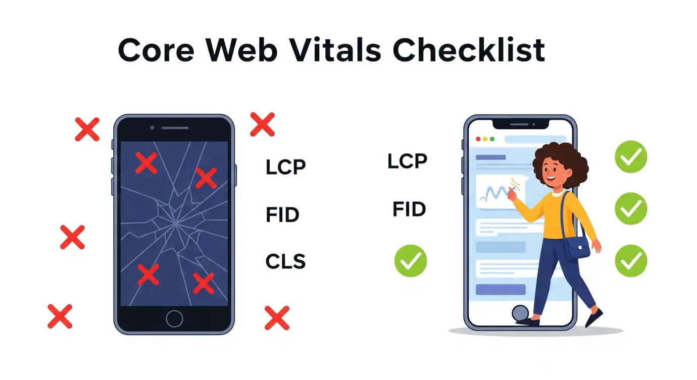
These three key metrics are absolutely fundamental to how well your mobile site performs in search and, more importantly, for your users:
- Largest Contentful Paint (LCP):
This is all about how quickly the main content on your page loads. Ideally, you want that to happen within 2.5 seconds of the page starting to open.
For an online store, this often means getting those product images and big hero banners to pop up fast. - First Input Delay (FID):
This measures how responsive your page is when someone tries to interact with it – like tapping a menu button, adding something to their cart, or clicking ‘buy’.
You want that delay to be less than 100 milliseconds. Imagine tapping a button and nothing happening instantly – frustrating, right? - Cumulative Layout Shift (CLS):
This tracks how much your page jumps around while it’s loading. A score under 0.1 is the goal.
There’s nothing more annoying on a phone than trying to tap something only for the layout to suddenly shift, making you accidentally click something else.
Your Go-To Plan for Mobile-First Optimization
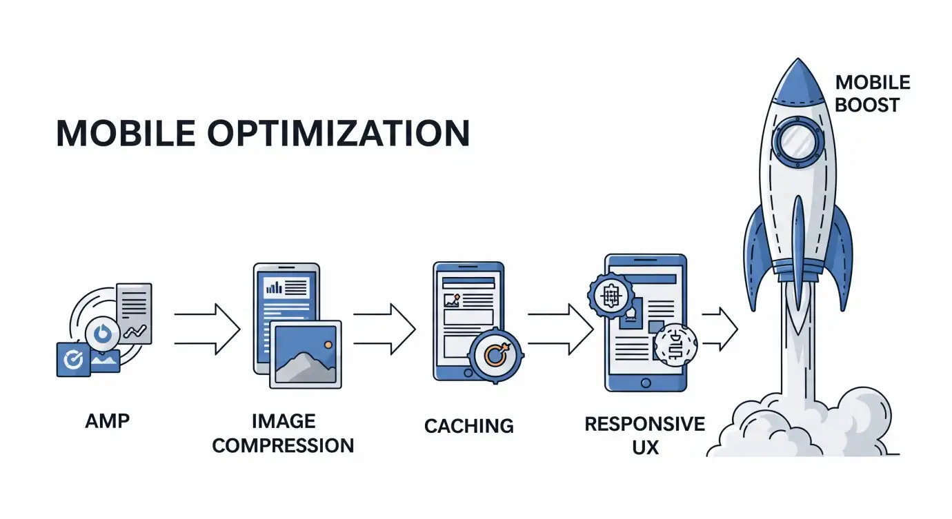
Building a Solid Technical Base: Speed is Everything
- Think strategically about Accelerated Mobile Pages (AMP):
You don’t necessarily need them everywhere, but for key pages like product listings or blog posts, they can drastically cut down load times.
I had a client whose mobile organic traffic shot up by 78% just by using AMP for their product catalog. - Get serious about image optimization:
Use formats like WebP when you can, implement lazy loading so images only load when they’re visible, and make sure images are sized correctly for smaller screens. Giant, uncompressed images are probably the biggest killer of mobile speed out there.
Tools like TinyPNG or setting up automated compression through your CDN are lifesavers here. - Tap into browser caching and CDNs (Content Delivery Networks):
Setting up proper caching tells a user’s browser to remember parts of your site, speeding things up on repeat visits.
And CDNs store copies of your site closer to your visitors globally. Just doing this can boost your LCP by a huge 40–60%!
Making the User Experience Sing

- Responsive design isn’t just about shrinking things down:
Your mobile site needs to genuinely adapt to different devices, how people hold their phone (portrait vs. landscape), and how they interact (touch vs. maybe a stylus). Test your site on actual phones and tablets, don’t just rely on browser tools. - Simplify navigation and search:
Mobile users are often on the go and impatient. They need to find what they’re looking for now. Use sticky navigation (where the menu stays put as they scroll), organize categories clearly, and offer a robust search with features like autocomplete. And hey, consider voice search – a surprising 27% of mobile users are using it regularly these days! - Streamline your checkout process:
Mobile checkout should feel quick and painless. Aim for just 2–3 steps maximum. Make guest checkout easy, offer multiple payment options including mobile wallets, and show people exactly where they are in the process.
Crafting Content for the Mobile Screen

- Write with mobile in mind:
Keep paragraphs short, use clear headings, and break up text with bullet points. Think about how you scan articles on your phone – that’s how most mobile users read (or rather, scan). - Don’t forget local searches:
Even if you’re shipping nationwide, mobile users often search with location in mind (“running shoes near me” or even just knowing they’re in a certain city). Make sure your shipping info is clear and consider how your site appears for local-related searches.
Specific Technical SEO Tweaks

- Use structured data markup:
Rich snippets that pull specific info like price or ratings are gold on mobile screens where space is tight. They can really make your product listings pop in search results. - Optimize for phone-specific features:
Make sure phone numbers are click-to-call, link directly into your app if you have one (deep linking), and ensure everything plays nicely with mobile browser features.
Keeping Tabs on Mobile Performance
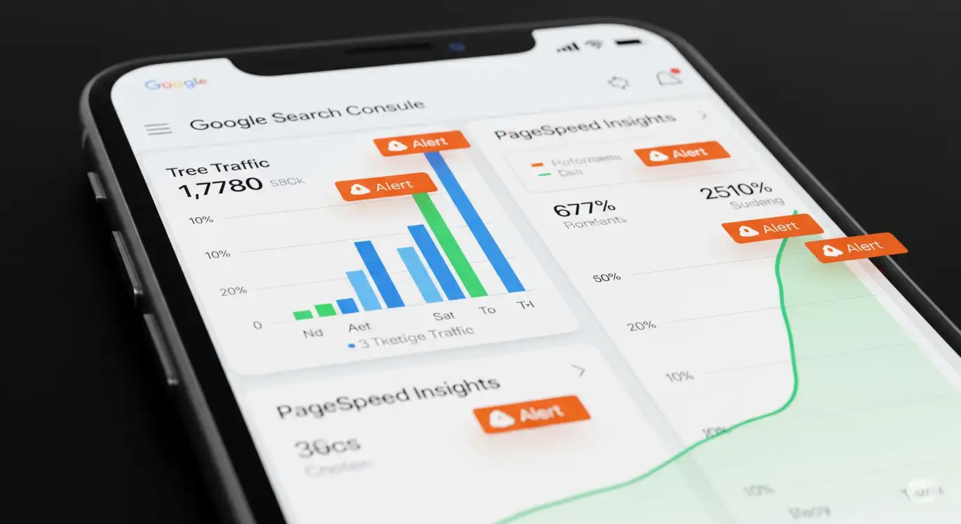
- Google Search Console is your best friend here. Dive into the mobile usability reports and keep a close eye on your Core Web Vitals data. Set up alerts so you know immediately if something crucial breaks.
- Google PageSpeed Insights offers specific tips tailored for mobile. Run checks often and track your scores over time to see if your changes are making a difference.
- Don’t forget your analytics setup:
Make sure you’re segmenting your data in Google Analytics so you can see exactly what mobile users are doing on your site – their paths, their conversion rates, how they behave differently.
Watch Out for These Common Mobile Optimization Blunders
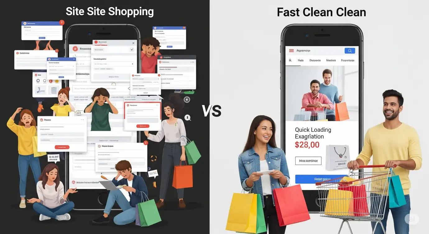
- Thinking desktop optimization is enough:
This is a big one! Just because your site looks great and performs well on a computer doesn’t mean it will on a phone. Mobile needs its own dedicated strategy and focus. - Using annoying pop-ups:
Google really doesn’t like intrusive pop-ups on mobile that block content. If you use them, make sure they’re easy to close and don’t get in the way of someone trying to use your site. - Neglecting mobile site search:
Seriously, a frustrating search bar on mobile is a conversion killer. Make sure yours is smart, offers filters, sorting, and presents results clearly.
The Payoff: Why Mobile Optimization is Worth Every Penny

The proof is in the numbers. E-commerce sites that get mobile right typically see:
- Conversion rates that are 67% higher
- Bounce rates that are 50% lower
- Page load times that improve by 200%
- Mobile organic traffic that jumps by 85%
I remember one fashion retailer I worked with. They invested around $15,000 into a full mobile overhaul. The return? Within the first year alone, they saw a 290% ROI purely from the boost in mobile sales. It’s not just an expense; it’s a serious investment with incredible potential returns.
Ready to Make Your Move? Your Mobile Roadmap Starts Now

Optimizing for mobile isn’t just following a trend – it’s essential for survival in today’s mobile-first world. The first step is usually a thorough audit to see exactly where your site stands. Then, focus on fixing those Core Web Vitals and making sure your design is truly responsive.
Thinking about truly transforming your mobile presence and watching your e-commerce success skyrocket? That’s exactly what SellerRocket.in specializes in for SMBs. Our process has helped over 500 businesses boost their mobile revenue by an average of 240%.
🚀 Don’t let a poorly performing mobile site cost you another customer.
Head over to 👉 www.sellerrocket.in today for a
free mobile SEO audit.
Let’s figure out how we can help you not only rank higher on mobile but also turn more of those mobile visitors
into paying customers.
Learn More : Social Commerce Trends 2025: Instagram & WhatsApp India